Using Python in Excel
Microsoft has added Python to Excel for Microsoft 365 users opening up new possibilities for financial modelling by combining the familiarity of spreadsheets with the power and flexibility of Python. This guide provides practical examples to help you apply Python in Excel for building, testing, and scaling models with ease.
🔑 Quick Start
- Enable: Formulas → Insert Python.
- Start a cell: type
=PYand pressTabto enter Python mode. - Read a range into Python:
xl("SalesData!A1:E205", headers=True) - Commit/run code:
Ctrl + EnterSaves and run the code. - Toggle output: Use dropdown left of the formula bar to switch between Python Object and Excel Value.
- #BLOCKED → Check Calculation mode (must be Automatic).
- ##### → Often network issue or returned object too large.
- #PYTHON → Calculation flow broken or reference error.
✅ Practical examples (copy & adapt)
Note: the exact helper function names (like xl()) may vary by Excel release or preview UI. The snippets below are representative.
1) Fast data cleaning (pandas)
Read a range, clean, and return a summary table.
import pandas as pd
df = xl("SalesData!A1:E205", headers=True)
df = df.drop_duplicates()
df = df.fillna(0)
df["Revenue"] = df["Units Sold"] * df["Unit Price"]
df.head(10)
If you toggle the output to Excel Value, the head(10) becomes a normal Excel table.
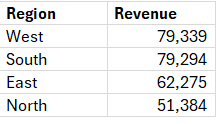
2) Aggregation / pivot (groupby)
summary = df.groupby("Region")["Revenue"].sum().reset_index().sort_values("Revenue", ascending=False)
summary
This will create a summary like below
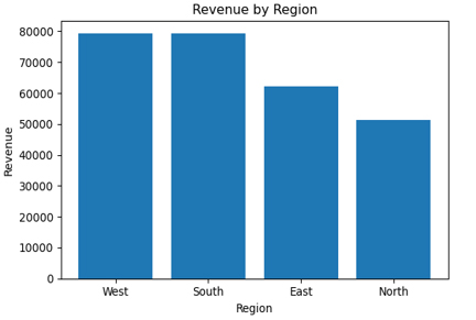
3) Quick chart (seaborn / matplotlib)
import pandas as pd
import matplotlib.pyplot as plt
cht = summary.sort_values("Revenue", ascending=False)
cht["Revenue"] = pd.to_numeric(cht["Revenue"].astype(str).str.replace(",", ""), errors="coerce").fillna(0)
plt.figure(figsize=(6,4))
plt.bar(cht["Region"], cht["Revenue"])
plt.title("Revenue by Region")
plt.ylabel("Revenue")
plt.xlabel("Region")
plt.tight_layout()
plt.show()
The chart will show as an image in Excel preview
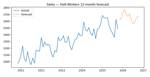
4) Forecasting (simple time series)
from statsmodels.tsa.holtwinters import ExponentialSmoothing
import pandas as pd
import matplotlib.pyplot as plt

df = xl("ForecastData!A1:B61", headers=True)
df["Month"] = pd.to_datetime(df["Month"], errors="coerce")
df["Sales"] = pd.to_numeric(df["Sales"].astype(str).str.replace(",",""), errors="coerce")
df = df.dropna(subset=["Month","Sales"]).sort_values("Month")
series = df.set_index("Month")["Sales"].asfreq("MS")
series = series.interpolate()
model = ExponentialSmoothing(series, trend="add", seasonal="add", seasonal_periods=12)
fit = model.fit(optimized=True)
forecast = fit.forecast(12)
out = forecast.reset_index()
out.columns = ["Month", "Forecast"]
out

# show plot
plt.figure(figsize=(8,4))
plt.plot(series.index, series, label="Actual")
plt.plot(forecast.index, forecast, linestyle="--", label="Forecast")
plt.legend()
plt.title("Sales — Holt-Winters 12-month forecast")
plt.tight_layout()
plt.show()
The forecasted plot will be shown as dotted line
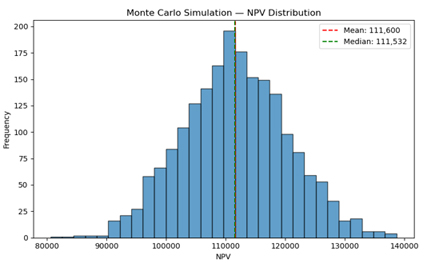
5) Monte Carlo NPV (useful for modelling risk)
import numpy as np
import pandas as pd

def npv(rate, cashflows):
    return sum(cf / (1 + rate)**i for i, cf in enumerate(cashflows, start=0))

base_cashflows = xl("'Monte Carlo'!B1:B11", headers=True).squeeze().tolist()
sim_results = []
for _ in range(2000):
    shock = np.random.normal(1, 0.08)
    cfs = [cf * shock for cf in base_cashflows]
    sim_results.append(npv(0.08, cfs))

pd.Series(sim_results).describe()
The following analysis will appear
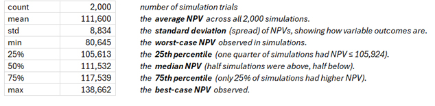
Depicted as a histogram
6) Pulling data from an API (example)
import requests
import pandas as pd
r = requests.get("https://api.example.com/marketdata?ticker=XYZ")
data = r.json()
df = pd.json_normalize(data["items"])
df.head()
If the cloud sandbox blocks requests, run locally (xlwings) and paste results into Excel.
⚙️ Best practices & patterns
- Keep calculations modular — use small, reusable functions.
- Return lightweight results to Excel; avoid sending huge DataFrames to the sheet.
- Cache intermediate results to prevent repeated heavy computations across =PY cells.
- Name Python cells with a header comment documenting purpose and inputs
(e.g.,# Inputs: B3:D1000). - Use Excel for presentation and Python for heavy lifting; keep final outputs in Excel.
- Test locally before sharing (xlwings / openpyxl) to ensure parity for colleagues not on preview.
🔒 Security & governance considerations
- Cloud sandbox: Python in Excel runs in isolated Azure containers. Check org policy before sending sensitive PII or regulated data.
- Consider anonymizing or aggregating sensitive data prior to cloud processing.
- Auditability: Keep a README or documentation sheet describing each =PY cell and link tests or source repo.
- Version control: Extract key functions into shared scripts/repos where possible rather than embedding complex logic only in workbook cells.
📚 Where to go next
- Microsoft docs / community: Search “Python in Excel Microsoft 365”.
- pandas / NumPy / matplotlib official docs for operations & plotting.
- StatsModels / scikit-learn docs for forecasting & ML.
- Local integration: xlwings for running Python locally with Excel.
🔚 Final thoughts
Python in Excel bridges spreadsheets and modern analytics. Use Excel for presentation and Python for heavy data work. Start small, document everything, and create templates so your team can scale adoption safely.
Download the excel file used